

Creating Effective Donut Charts for Data Visualization : In an ever-increasing data-centric world, it’s essential to represent information clearly and understandably. Donut charts are incredible tools for data visualization that offer a visually engaging and straightforward method to depict percentages or proportions as parts of a whole.
Keep reading to enhance your knowledge about donut charts and learn how to create them effectively.
Understanding Donut Charts
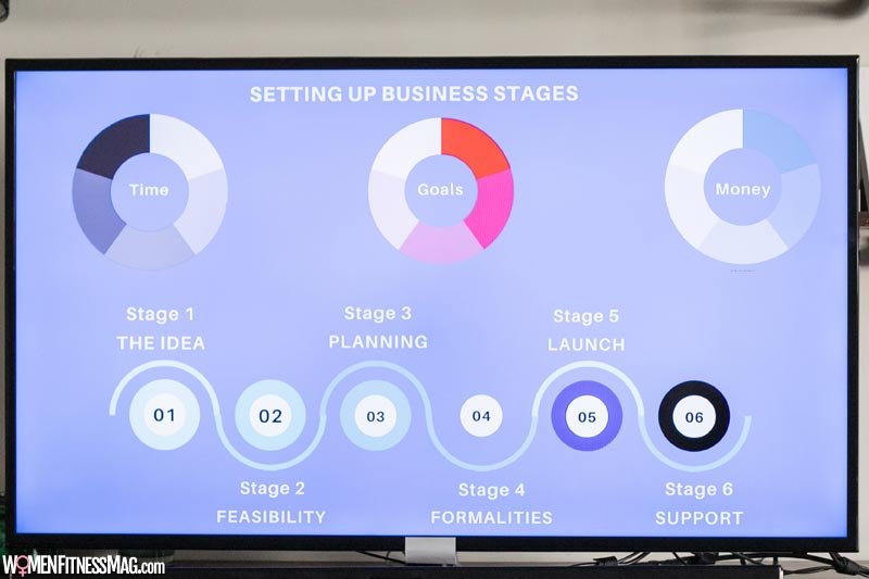
A donut chart is a hollow circular chart split into segments, displaying numerical proportions. Donut charts are similar to pie charts in many ways. However, the key differentiator is the blank center, which makes the chart look like a donut, hence the name.
Donut charts provide a better visual effect and are considered an aesthetic improvement over pie charts. They break down data into proportional segments, representing a particular category. The size of the segment reflects the proportion of that category in relation to the total.
Donut charts are undoubtedly excellent for displaying statistical data, thanks to their readability and simplicity. They can be used to illustrate different areas for business, such as revenue breakdown and web traffic sources, or to represent demographic distributions in surveys. This tool can simplify complex data sets and make them understandable for stakeholders with no data background.
Effective Designing of Donut Charts
When it comes to designing donut charts, simplicity and clarity should be your guiding principles. Remember that the main goal is clearly and effectively communicating data to your audience. To achieve this, you need to provide an easy-to-understand visual representation. Consider using contrasting colors for the segments to make them distinguishable. The colors should also complement each other to make the chart visually pleasing. The use of labels is another critical aspect of designing donut charts. Consider using concise, clear labels for each segment for easy understanding.
Chart placement is another essential element of effective chart design. A well-placed chart can contribute significantly to the readability of your content. For instance, placing your chart next to the corresponding data or information makes it easier for the audience to connect. Interactive donut charts are also an effective way to engage with your audience. These charts allow users to interact with the data, often by hovering over segments to see more detailed information.
Benefits of Using Donut Charts
Donut charts offer a multitude of benefits for data visualization. Apart from providing an easy-to-understand representation of data, donut charts can simplify complex data sets into understandable information. They are excellent for explaining inherently comparative things, such as the percent breakdown of a budget or demographic information in a region.
In addition, donut charts can portray data with precision. By representing every subset of data as a clearly defined segment, a donut chart enables users to see at a glance the proportion of each category in relation to the whole.
Tips for Effective Utilization of Donut Charts
A well-designed donut chart is an excellent tool for data visualization, but it’s crucial to use it properly to avoid potential pitfalls. Reduce the number of slices in your donut chart to limit visual clutter. It’s often recommended to have six or fewer segments in a donut chart for better readability.
Make sure your chart’s labels are clear and concise so that viewers can quickly understand each segment. An often-overlooked tip is to arrange the data in your chart to progress clockwise or counter-clockwise from largest to smallest. This arrangement will feel more natural and easier for viewers to follow and interpret.
Lastly, consider using the empty central space of the chart to include key information or a summary of the data. This could be the total number being represented or a call to action. You could also compare the hole size to other elements on your page as a form of contextual comparison.
Donut charts can be incredibly effective tools when it comes to data visualization. Their simplicity and visual appeal make them suitable for a wide range of data types and audiences.
Related Videos about Creating Effective Donut Charts for Data Visualization :
Creating Effective Donut Charts for Data Visualization
Creating effective donut charts for data visualization in excel, Creating effective donut charts for data visualization example, donut chart in tableau with percentage, how to create donut chart in tableau, donut chart excel, donut chart maker, when to use donut chart vs pie chart, tableau donut chart with one measure,